
Trnsprtr Brand Identity
The brief was to create a modern brand for a new logistics & storage business based across the UK. The Brand needed to be ultra-modern and reflect the moves the industry as a whole is making to become more eco-friendly and approachable. However the brand needed to not go too far in terms of the eco-friendly aspect as part of the logistics fleet would continue to be combustion based for several years to come.


The logo
A logo is always the face of a brand and with this project I wanted to meet the brief head on and create an “ultra-modern” and very abstract monogram. This was achieved by using simple shapes to piece together a vehicle. The circles form the wheels, the semi circle forms the cab and the two square sections depict the trailer. The modernity and abstract nature of the marque is softened with the pairing of a serif typeface which brings the logo together nicely.
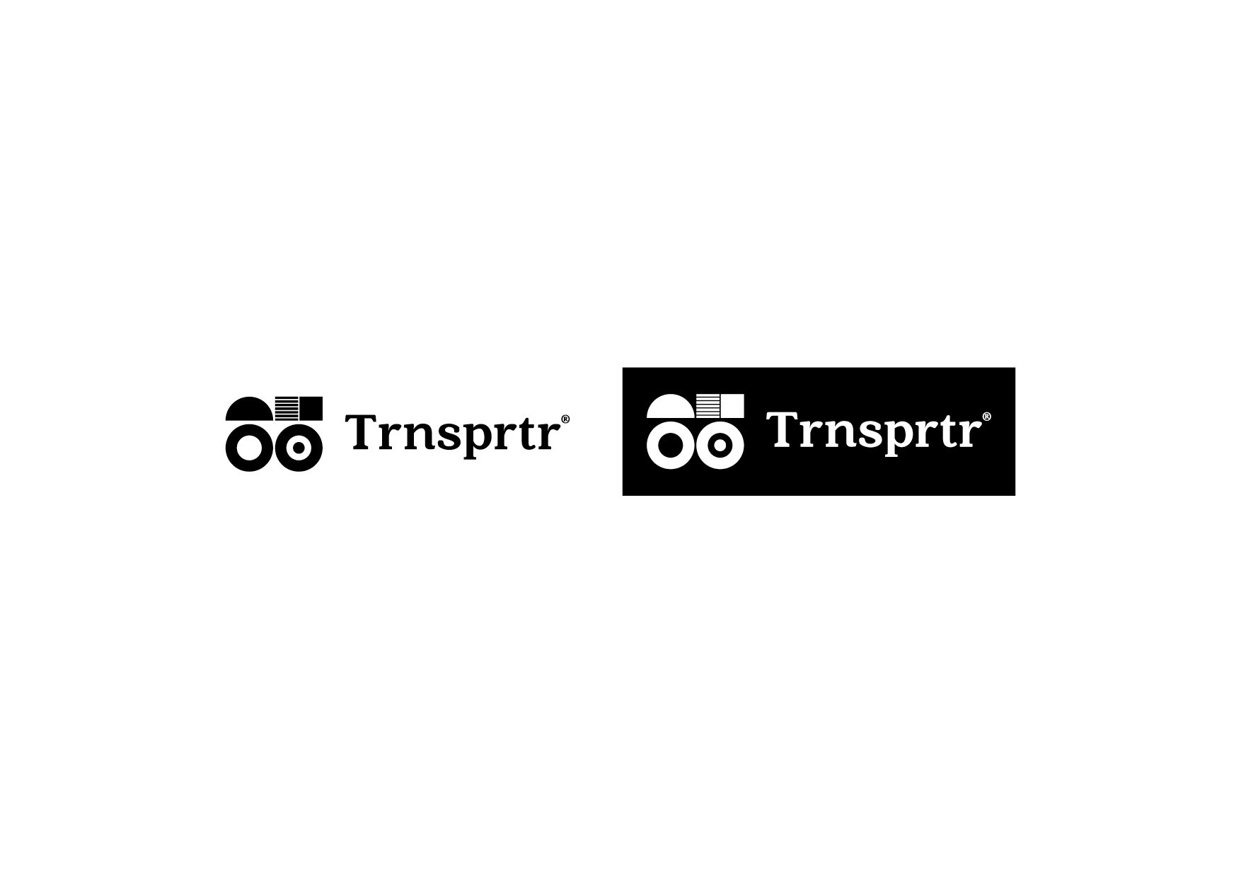

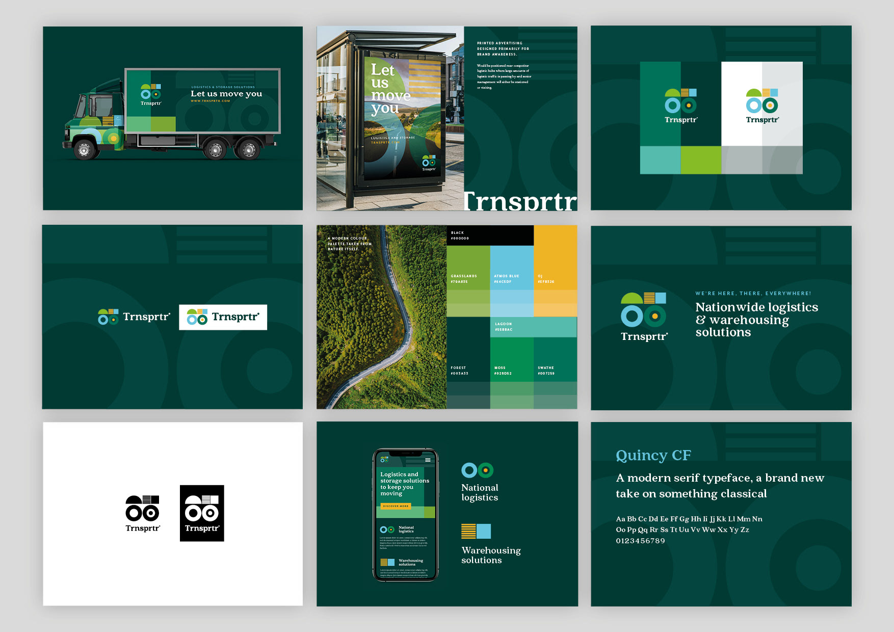
Stacked?
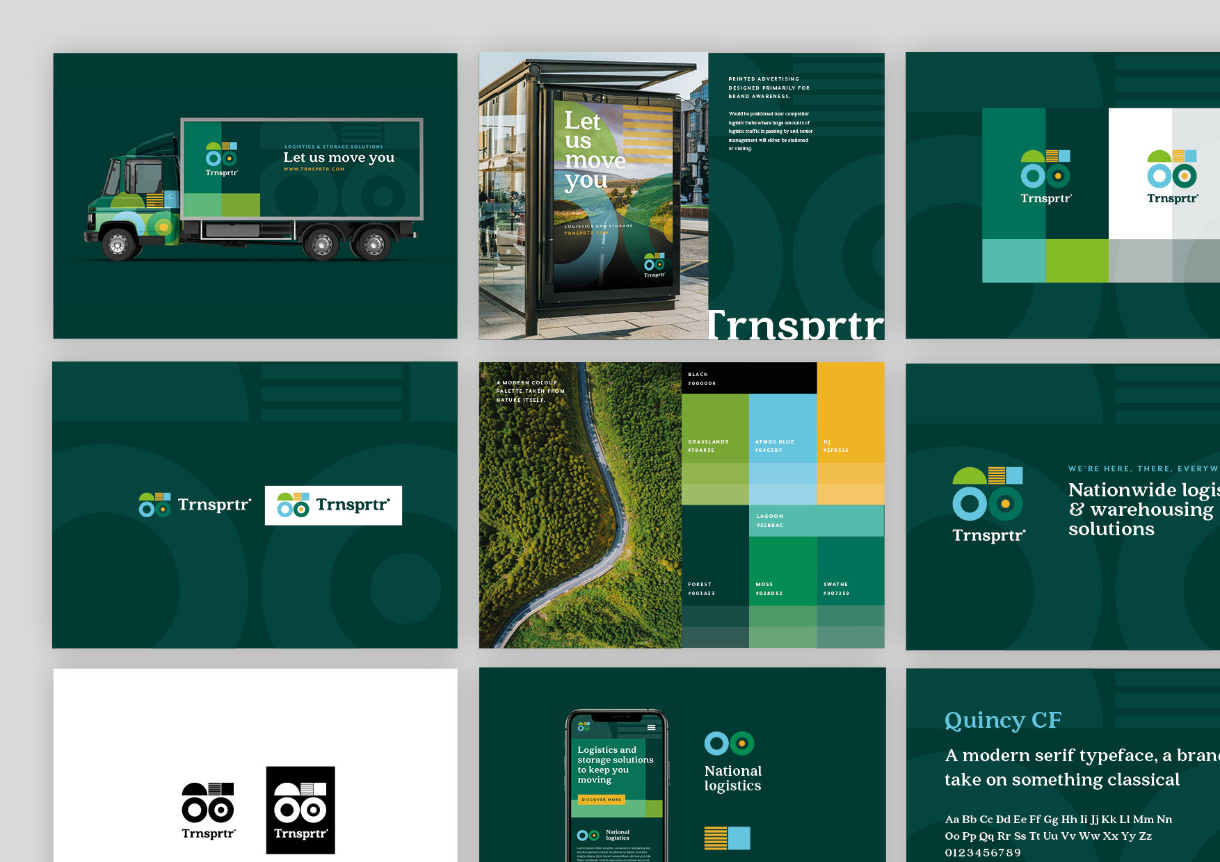
Two versions of the logo were created, stacked and horizontal. This was to ensure the logo could be used across a wider variety of mediums and spaces. Sometimes a stacked logo just doesn’t quite fit the space available.


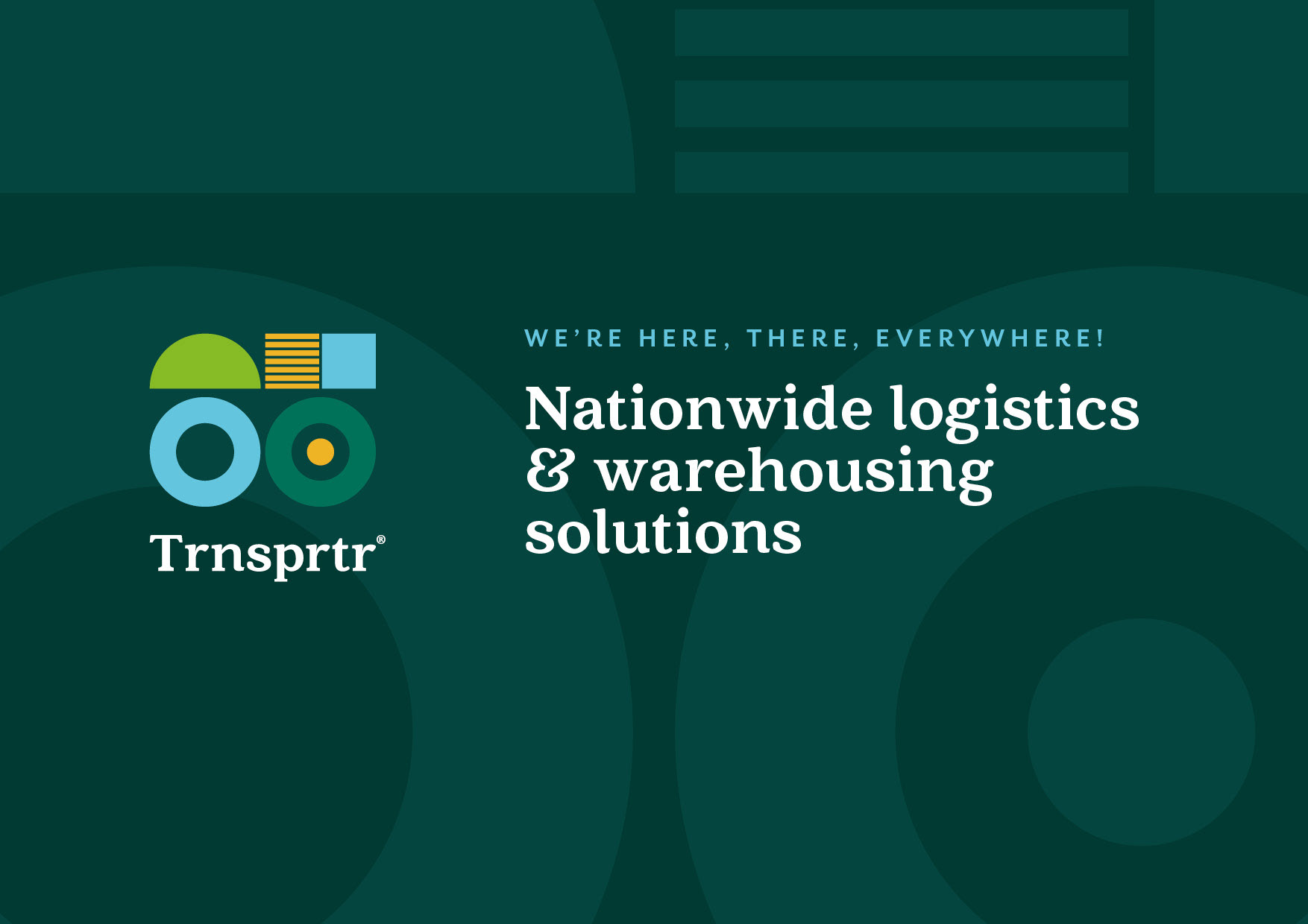
Colour Palette
The colour palette has been derived by both the surroundings and some historic elements of the logistics industry. Due to the amount of time logistics vehicles spend on the roads it seemed like a nice idea to tie that in to the countryside they’re travelling through. This also allows the brand to be given the eco-friendly look and ethos the business is striving towards.


Type it out
Typography is always crucial to a visual identity and with this project I really wanted to soften the modern feel slightly with a serif typeface. A serif font such as Quincy is elegant, neat and classy whilst still being modern enough to not look old fashioned. The brand also needed to stand out against competitors who generally stick to block capitals stating the business owners name. I feel this was achieved through the choice both the primary and supporting typefaces. Kerning when needed also allowed the visuals to look more purposeful. Messaging and tone of voice are also essential to a brand identity, with Trnsprtr being playful with words was important to getting the message across, steering clear of the standard boring stereotypes within the logistics industry was imperative to the brand's success.


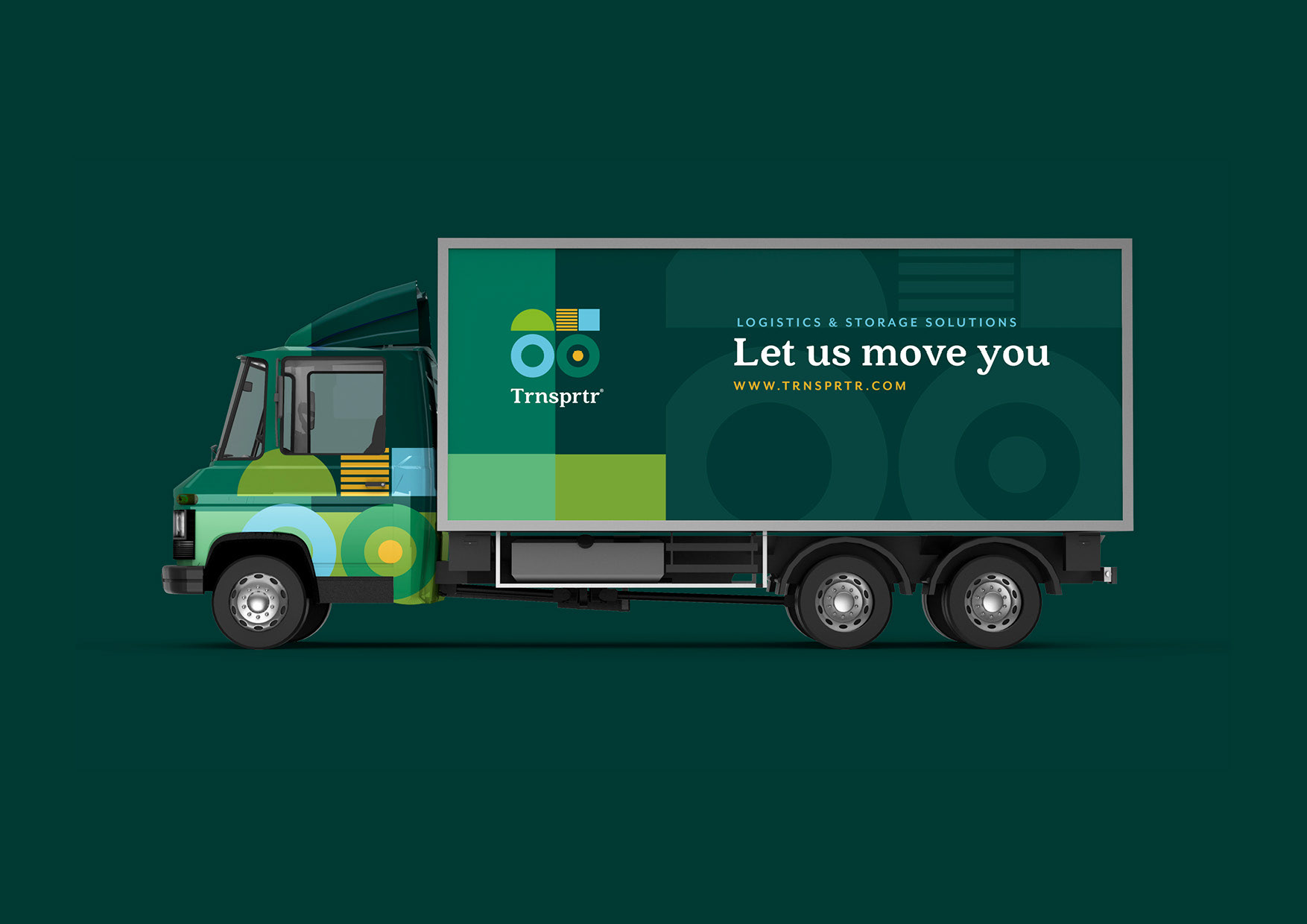
Getting it all out there
The branding is useless unless applied in the real world and that’s what these concepts demonstrate. From business cards to HGV wraps the branding has been tested across different mediums.


Thank you for your time